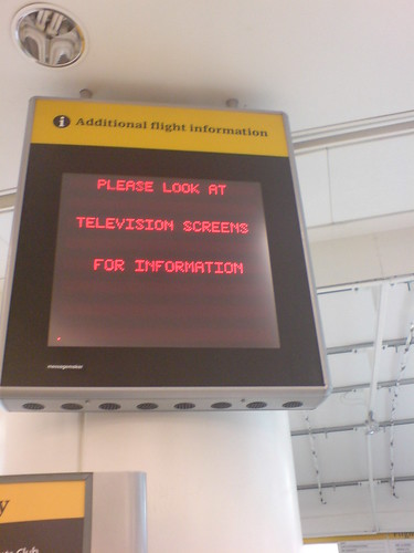
A display in Gatwick Airport, asking readers looking for “Additional flight information” to check “television screens”. From the usability viewpoint, this might raise a few questions:
What is the difference of this display to what they refer to as “tv screens”? Way of transmission of displayed data? TV signal over coaxial? Something digital? Doesn’t TV do both these days? Or is the difference the way of displaying data? LCD versus CRT? Flat screen versus the old big box (as cathode ray tube might not be in everyone’s daily vocabulary)? Don’t they do TV-s with both technologies these days? Oh, wait, Television was the thing with moving full screen pictures, CNN & soap operas? So the flight data is somewhere as video? Uhh…
If you don’t have anything useful to say on a screen or a sign, just turn it off.
Or in this case, maybe show a big arrow facing towards the location of useful screens instead of trying to describe them vaguely.
Airports (even if subway maps are cooler) are a very interesting area for user-friendly design, due to the busy schedules, complicated logistics, mass of very short-term users and — above all — overwhelming amount of information on those. Apparently there are about a million web pages talking about “airport signs usability” alone out there.